AD
Turning a fragmented brand into a powerful platform.


Category B2B branding
An industrial-strength B2B makeover.
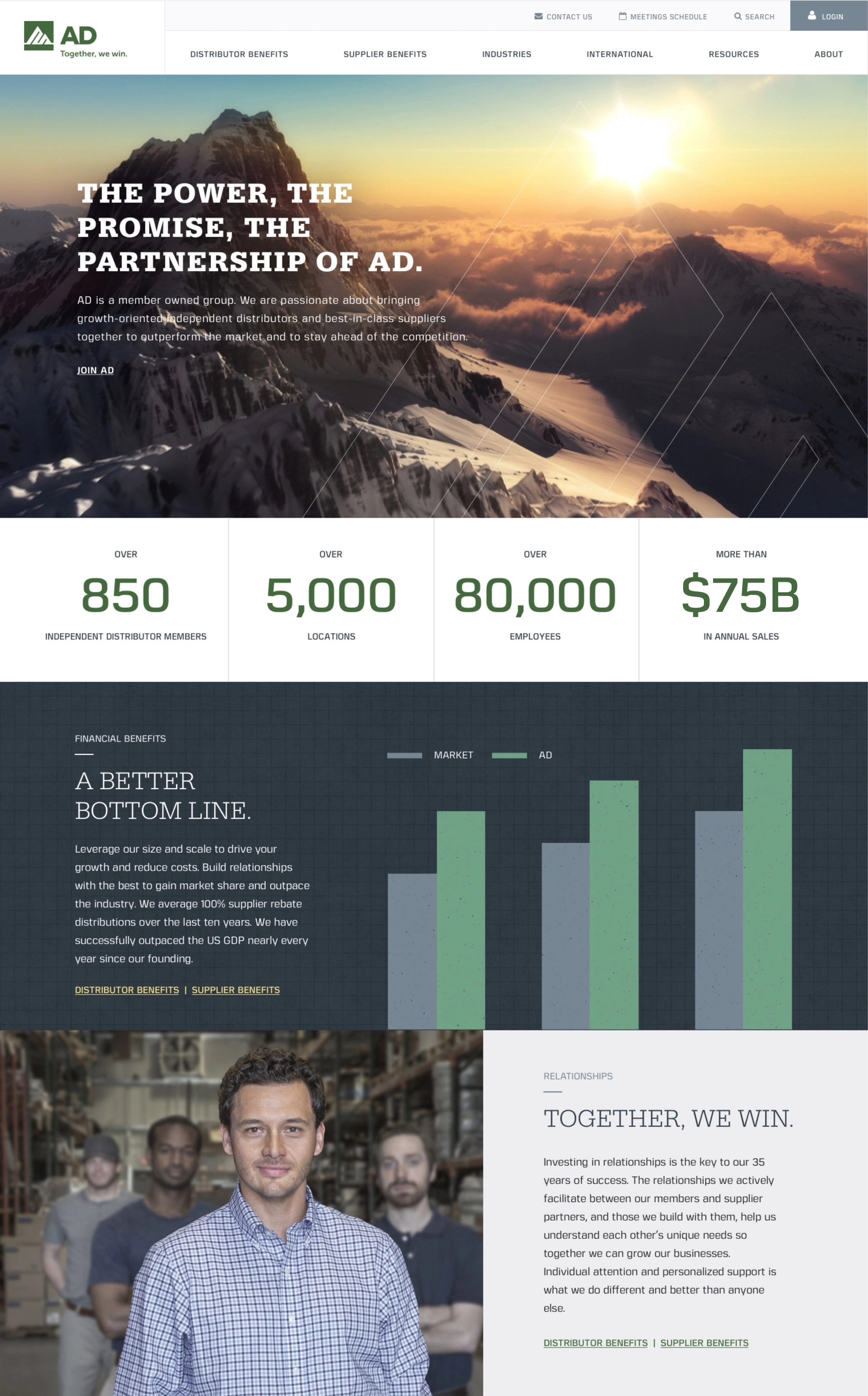
AD is a fast-growing $75B industrial buying and marketing group that found itself in the midst of an identity crisis.
After years of expanding through mergers and acquisitions, their brand had become fragmented and it became difficult to tell a clear and compelling story about the meaningful value they provide to potential new members.
They turned to JK to cut through the clutter and create a single powerful story that lets their unique advantages shine.
Deliverables
- Branding
- Messaging
- Visual identity
- Brand architecture
- Brand launch & development
- Website design & development
- Campaign development
- Motion graphics & live video
- Photography
- Art & graphic design
- Print & packaging
A focus on what sets them apart.
Through our collaborative branding process, we worked hand-in-hand with key client stakeholders to build a brand based on what AD does best: Teaming up to help their members outperform the market.
This was the foundation of a strong brand position—Together, we win.—that lets AD tell a singular strong story across seven industries and three countries.
It’s a tagline that quickly gets to the value AD delivers, reflects their focus on collaboration, and is something that no one else in their space can say. All told, it’s a powerful, ownable brand position for a uniquely capable organization.
Colors
Brand typography
A well documented design system.
Comprehensive brand guidelines shared AD’s robust design system and their new messaging, assuring their creative partners understood how to implement the brand while creating consistency across all communications touchpoints.


Two stories living in harmony on one website.
AD serves as a bridge between distributors and suppliers—and they have a lot to offer both audiences. To make sure the benefits were crystal clear to both groups, we created two parallel user paths through the website, using different imagery and language for each. This allowed AD to tell a compelling, focused story to each audience without bogging users down with information that isn’t relevant to them.
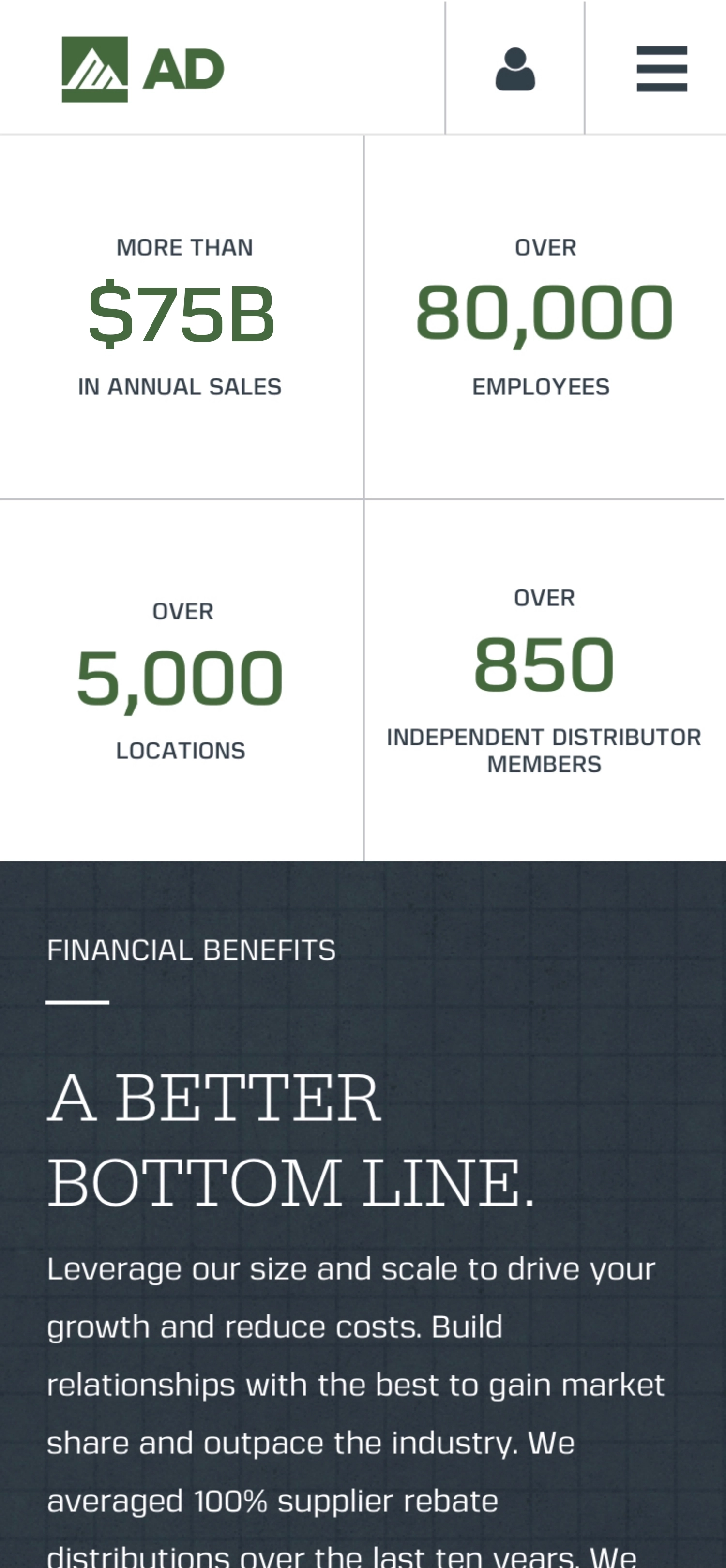
And because AD’s size and strength gives them unequaled purchasing power—a key differentiator that’s very attractive to prospects and partners—we created an eye-catching animated graphic on the homepage featuring the impressive statistics that highlight AD’s massive scale.


A brand built to last.
With an engaging new brand in hand, we also refreshed AD’s print collateral, helping to seal the deal in a tangible way with prospective new members.
And over time, the brand’s adaptable visual style has allowed us to put a spin on the design for annual meeting themes, special editions of their in-house magazine, one-off events, digital campaigns, and more, all while still staying true to the brand’s foundations.


It’s a brand built to last and a relationship that has also endured and evolved, because together JK and AD have worked to successfully optimize the impact of every communications touchpoint, which has helped to fuel their continued growth.
Or to put it another way—Together, we win.


An accessible video style reflects the one-on-one relationships upon which AD’s organization has been built.
Putting AD in control of their own image.
After the brand launch, AD wanted to have their own photo assets—ones that reflected the spirit of the organization in ways that stock photography couldn’t match. JK obliged by developing an ownable photographic style for the brand and then we scouted locations, casted talent, captured and retouched images, and created a custom photo library that put AD in full control of their visual style.


JK helped us really define our vision and share it in powerful new ways, ones that have helped to drive growth for us and our members.


(formerly Sr. VP of Marketing, AD)